


 12 / 41

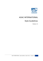
LOGO: DO’S AND DON’TS
INCORRECT USE OF LOGO
1.
Don’t change the logo’s orientation
2.
Don’t bevel or emboss the logo
3.
Don’t place the logo on a busy photograph
or pattern
4.
Don’t add “glow” effects to the logo
5.
Don’t present the logo on “vibrating”
colored backgrounds or in outline only
6.
Don’t place a transparent logo on similarly-
colored background
7.
Don’t outline the logo in any color
8.
Don’t add “drop shadow” effects to the logo
9.
Don’t put a white box around the logo when
placed on a dark or busy background
10.
Don’t reconfigure the color or change the
size or placement of any logo elements
11.
Don’t stretch or squeeze the logo to distort
proportions
12.
Don’t recreate elements or replace with
something else.
13.
Don’t make the logo too small
1. ORIENTATION
2. BEVEL/EMBOSS
3.BUSY PHOTO/PATTERN
4.GLOW
5.VIBRATING/OUTLINE
6.BACKGROUND
7.OUTLINE LOGO
8.DROP SHADOW
9.WHITE BOX
10.RECONFIGURE
11.STRETCH/SQUEEZE
12.RECALCULATE
13.
Incorrect Standard Logo
(too small/illegible)
13. Incorrect Logo w/ Tagline
(too small/illegible)
AOAC INTERNATIONAL | Style Guidelines | April 9, 2015 | Version 1.3
12