


 10-11 / 68

8
Discovery
Rooms!
a
l
um
i
ni
u
m
g
re
y
(
12
1
-1
5
9
)
a
n
ti
q
ue
gr
e
en
(
1
2
1-
1
3
0)
r
o
c
ky
br
o
w
n
(
12
1
-0
7
0
)
de
s
e
rt
b
ei
g
e
(
12
1
-0
9
8
)
C
u
rc
u
m
a
3
0
P
i
n
i
e
1
2
0
C
o
e
li
n
6
0
S
a
p
hir
1
2
0
C
u
r
r
y
5
5
P
a
la
z
z
o
2
3
5
P
a
l
a
z
z
o
2
1
0
F
l
o
o
r
C
o
l
o
r
W
a
l
l
C
o
l
o
r
Color Concept
Inspired by Nature –
Harmonious Color Scheme
All the materials used in the grow.upp concept and their colors (wall,
noor, cabinets, artimcial leather and fabrics as well as carpets) are
coordinated and harmonious.
Light pastel tones and almost white tones, with a low
proportion of bright colors in the overall color spectrum,
help to relax the children/teachers. Pastel blue and green
nuances are more activating and stimulating compared
to light pink and yellow.
Wall Color
All noors shown above are specially color-coordi-
nated with the grow.upp concept. Light noors are
recommended for group rooms so that the contrast
to the wall color is not too strong.
Floor Color
The Caparol company has been around since 1895
and manufacturers coating materials. In cooperation
with the HAWK (University of Applied Sciences and
Arts) they have demned color concepts for educational
spaces which are based on sound scientimc data.
Armstrong World Industries is a globally operating
manufacturer of noor covering who has been around
since 1864. In Europe, Armstrong markets elastic and
textile covering through the brand DLW. Armstrong
specialises in nooring for the health and educational
sectors, shop mtting and also in residential and ofmce
buildings.
For a color scheme, the
effects
of
color and material
play a
decisive role
. A successful result occurs when the material, color and
light are
specially matched
to the respective room and its function. The focus should always be on the children, rather than the
personal color preferences of individual decision makers.
Younger children
should have
subtle
colors in rooms where they stay
for longer periods of time.
Nature gives us a rich spectrum of
harmonious color combinations
, which can be inspirationally transferred to the interior concept.
Natural color schemes awaken
positive associations
. They are perceived to be harmonious and
give a sense of security
. This is
why our grow.upp concept is characterised by natural color tomes. Both
stimulating
and
regenerating color tones
are used.
All the materials and colors used in the grow.upp concept (wall color, noors, cabinets, artimcial leather, fabrics and carpets) are opti-
mally coordinated. Color decisions are facilitated with the consciously selected and beautifully clear color spectrum.
All room concepts and their color
designs can be found from page 36.
grow.upp
- Discovery Rooms
9
Transfer Center
for Neurosciences
and Learning
* (From: Arndt, P. A. (2012). Gehirn, kognitive Beanspruchung und Ko-Konstruktion:
Lernräume ressourcenorientiert gestalten. Die Grundschulzeitschrift, 225.256, 66-69.)
** (Arndt, P. A. (2012). Design of Learning Spaces: Emotional and Cognitive Effects of Learning
Environments in Relation to Child Development. Mind, Brain, and Education, 6(1), 41-48.)
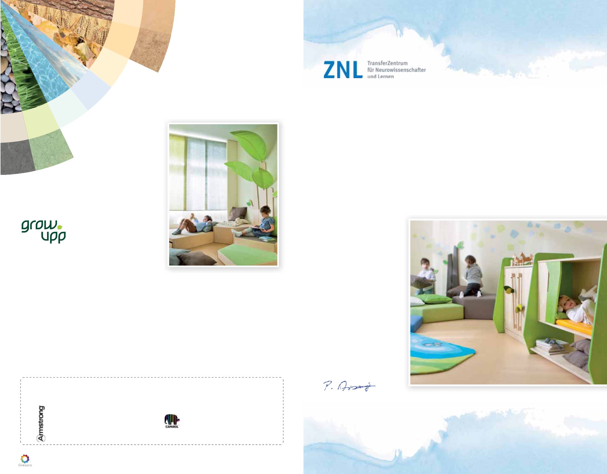
Children need to feel at ease in their surroundings to ensure healthy development, to learn new things and to mnd
the courage to sometimes try things which are difmcult. Child-oriented rooms should therefore be furnished in such a
way that children
experience
a feeling of security
, and at the same time mnd
stimuli
for
their further development
.
These seemingly contradictory requirements for room design can be best fulmlled when we orient ourselves toward
the
natural environment.
People – regardless of whether young or old – have an innate preference for natural environmental aspects: “
natural
“
and
close-to-nature components
of space and architecture conserve the cognitive and emotional resources of the
children and adults. These components include sufmcient daylight, green spaces, and plants in the room or on the
building. For interior decoration design natural materials, such as
wood
, or
an appropriate color scheme
, and a
division of the room into open, clearly arranged areas and protected areas for retreat, can help conserve resources.
The relieving effect of such measures is relaxing tothe children and adults.
A secure area for retreat offers a basis for children to live out their natural curiosity and joy of discovery. People, such
as parents and caregivers, offer this “secure space”. Appropriately designed and color coordinated retreat spaces
and cubby hole corners also offer
the required emotional security. This
is particularly important for younger
children who are only just learning to
regulate their emotions, e.g. insecurity
and frustration. Well-designed rooms
can support this learning process and
the learning of independence, without
overstimulation. If someone has a
secure space which they can retreat to
at any time, then they can occasionally
venture out and take on new challen-
ges.
While with younger children familiarity
represents important components for
the feeling of security, with older child-
ren aspects such as order and clear
arrangement become increasingly
important.** Because children develop
at different rates, and sometimes need
more or less security depending on
their mood or the demands placed on
them, it makes sense to have opportu-
nities for retreat available for children of
every age.
Dr. Petra Arndt
Project management “Education Centre 3 - 10”
Transfer Centre for Neurosciences and Learning (ZNL)
University of Ulm
Interior Design Concepts Which are Close
to Nature Offer Both Security and Stimulation