


 10 / 10
GRAPHIC COMPONENTS
Web Design
8
Background elements
When designing large background elements light gradients can be used to cre-
ate lightness and the feeling of space, as well as separating these elements from
the white background. This should mostly be used in the brand area of HTML
sites. The same style can be used in banners.
dividers
Dividers are used to separate certain elements from each other. Divider elements
should be sharp and light. The most common style is a 1 pixel light line.
NAVIGATION ELEMENTS
Navigation elements should use light 3D background elements to lift them up.
On HTML sites the top level main navigation is an exception as it is dark grey
with a light gradient. It is important to present navigation elements clearly and to
present the current location to the user. Navigation elements should not contrast
too strongly against the overall style.
buttons and functional components
Buttons are characterised by a light 3D style and sharp outline. The basic button
style is light grey with a gradient and fully rounded corners. The same style with
less rounded corners can be used for other functional components. If components
are large ensure that the style remains light and sharp. Where possible use ready-
made buttons from the PSD template files.
Interactive ICONS
The icon style is graphic and simplified. The sharp form language of the Futura
font family is followed. When using common functionalities, such as search, the
common form language is used to ensure usability.
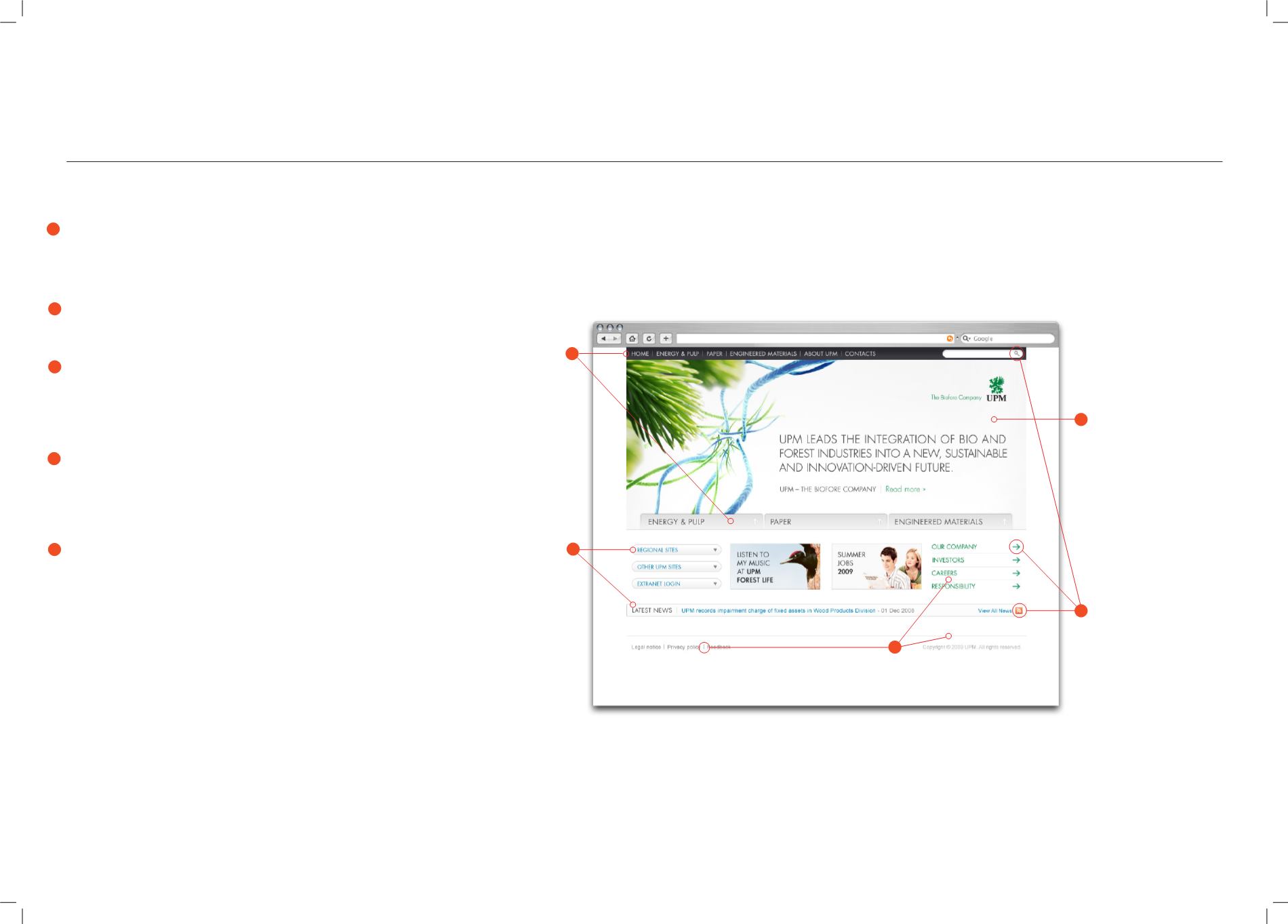
The style of graphic components or “skin” is an impor-
tant part of the UPM web style. Components should be
sharp and highly distinguished. The most common char-
acteristics of component styling are light gradients, sharp
outlines and dividers, and sharp forms. When designing
web applications use ready-made component sets from
the PSD templates whenever possible.
1
2
3
4
5
1
2
3
4
5