


 5 / 10

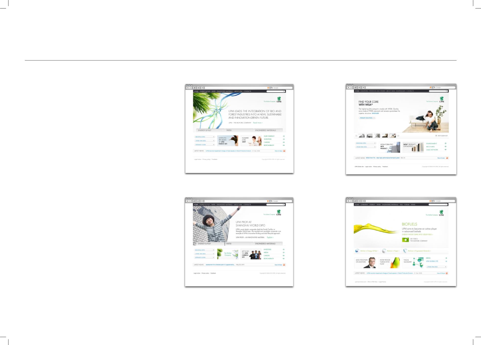
This chapter explains the UPM web style and the build-
ing blocks needed for designing web applications. The
style can be used for designing HTML/CSS-based web
services and other digital applications.
UPM ONLINE DNA
Web Design
3
First impression
The user should immediately relate to the graphic language of UPM. The UPM
web style should be familiar to users who have been browsing any current UPM
service. Any UPM web application should feel
fresh, clear, modern, sharp, credible and distinguished.
white space
UPM web applications are relatively bright. White space is used to create a
fresh and clear feel. White is the background colour for most UPM sites and
services. When creating compositions, white space should always be thought of
as one of the key compositional elements of the UPM visual language. Composi-
tions should be built on white backgrounds and white space should be used to
divide components.
USE OF COLOuRS
Colours should be used discreetly in online UPM applications. Large colour
areas should be avoided. Colours are fresh and based on the UPM web palette
(see UPM Web Colours). Main colours are mostly used to highlight interaction.
Other colours may be present through the use of images.
COMPOSITIONS
Compositions should be clear and prioritised. The alignment of elements should
be grid-based. The basic composition of HTML sites is formed with a dark
header bar, large main brand area below it, and a main content area next be-
low. The size contrast between the brand area and content area depends on the
nature of the site and the page within the site. On front pages the brand area
should be relatively large with the brand message clearly emphasised. On con-
tent pages the top brand area should be smaller to give more space to content.
CUT OUT IMAGES
The UPM brand image style is based on high quality images that are cut out.
The technical term is “masking” or masked images. In web applications, cut out
images should be used in main image areas and banners. Light gray shades
can be used to separate image areas from the background.
GRAPHIC COMPONENTs
The particular graphical component style or “skin” is an important part of the
UPM online DNA. Components should be sharp and highly distinguished. The
most common factors of component styling are
light gradients, sharp (1pixel) outlines and dividers, and sharp forms.
When designing a certain application please study the
related individual application guidelines, in addition
to these overall guidelines. When creating visuals use
ready-made templates and componets where possible.