


 2 / 12

2 |
Ten Year Network Development Plan 2015 Annex C5
0
2,000
1,000
3,000
4,000
TWh/y
Scenario A
TYNDP 2013
Scenario B
2015
2016
2017
2018
2019
2020
2021
2022
2025
2030
2035
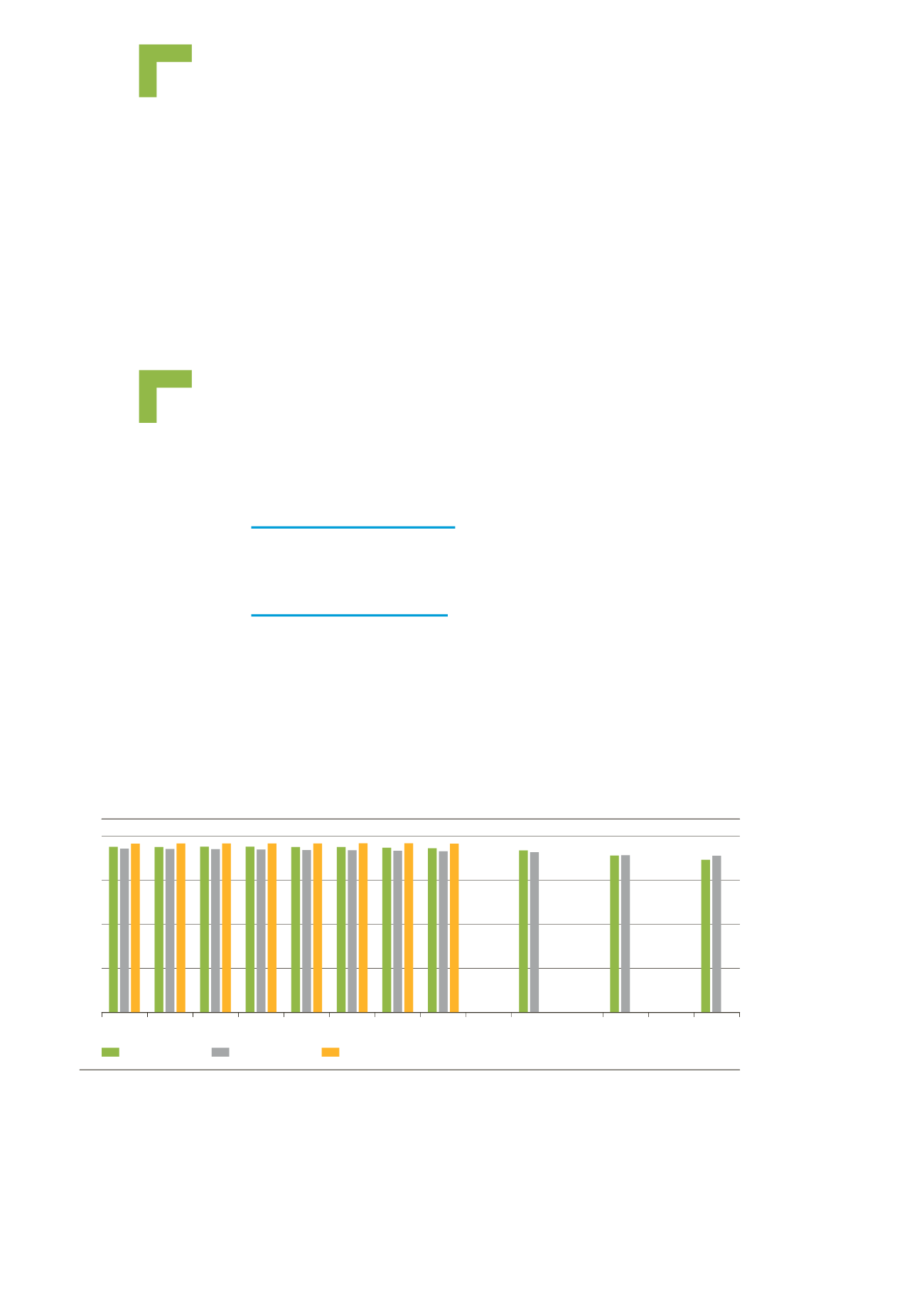
Figure 1.1:
Comparison of annual final gas demand between TYNDP 2015 and TYNDP 2013
Evolution of demand and
supply scenarios
In this Annex, the scenarios of TYNDP 2013–2022 and
TYNDP 2015–2035 are compared in order to help the
understanding of the change in the visions of the future.
1 Gas demand scenarios
1.1 ANNUAL GAS DEMAND
1.1.1 Final annual gas demand
Compared to the 2013 TYNDP edition, final gas demand projections tend to be more
conservative with lower figures throughout the whole period. This maybe a result of
TSOs taking into account the ongoing economic crisis, which has been longer and
deeper than generally expected. The difference ranges between -2% and -3% for
Scenario A and between -3% and 5% for Scenario B. In the TYNDP 2013 the trend
was almost flat over the whole period, whereas TYNDP 2015 projections decrease
representing a change of -8% in Scenario A and -4% in Scenario B.