


 4 / 12

4 |
Ten Year Network Development Plan 2015 Annex C5
0
18,000
12,000
6,000
24,000
30,000
GWh/d
Scenario A
TYNDP 2013
Scenario B
2015
2016
2017
2018
2019
2020
2021
2022
2025
2030
2035
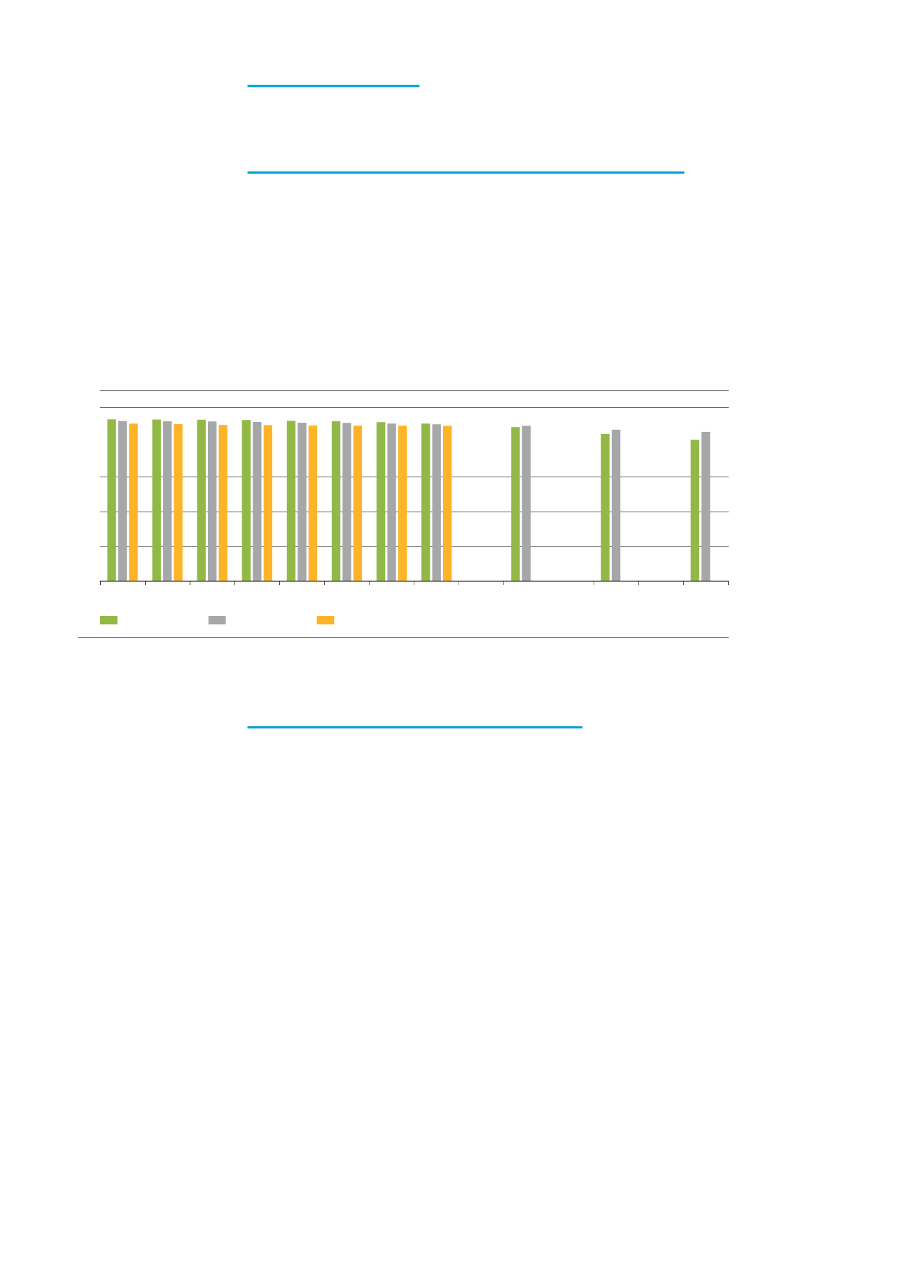
Figure 1.4:
Comparison of peak day gas demand between TYNDP 2015 and TYNDP 2013
1.2 PEAK GAS DEMAND
1.2.1 Final peak day gas demand (residential, commercial and
industrial)
Final peak day gas demand is slightly higher than in TYNDP 2013, but follows a
downward trend. Whereas TYNDP 2013 projections decreased by 1.4%, TYNDP
2015 figures decline by 6% in Scenario B and by 13% in Scenario A. TYNDP 2013
peak projections were lower whereas annual projections were higher. This could be
explained by the lack of disaggregation in some of the data for peak day projections
in TYDNP 2013 and by the increase in peak day projections from several TSOs in
TYNDP 2015.
1.2.2 Peak day gas demand for power generation
TYNDP 2015 peak day gas demand for power generation is lower compared to
TYNDP 2013. On average, figures for Vision 3 are 15% lower and figures for Vision 1
are 20% lower. TYNDP 2013 figures showed an increasing trend in the short term,
stabilizing in the medium term, and leading to a 17% increase at the end of the pe-
riod. TYNDP 2015 projections show a continuous upward trend ending with a 46%
higher peak day gas demand for power generation in Vision 3. Vision 1 shows a sim-
ilar trend to TYNDP 2013 projections with an increase of 17%. Although starting
from different initial levels, it should be noted that all three projections represent an
upward trend.